Then came character
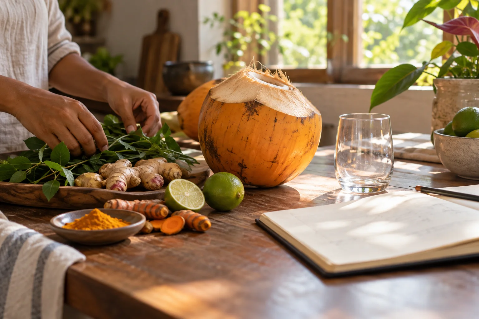
Each expression needed to feel distinct without becoming noisy. Some moved toward warmth. Some toward brightness. Some toward a greener botanical character. The work was not to add more for the sake of more, but to understand what belonged together and why.
A visual language began to form
ORAVELA also needed a way to be seen. Colour, naming, bottle format, label rhythm and photography all had to support the same idea: a contemporary beverage shaped by Sri Lankan natural abundance and thoughtful craft.
The words mattered too
The language had to stay calm, precise and honest. ORAVELA could speak about ingredients, process and moments without pretending to be a cure, a trend or a shortcut.
Still at the beginning
There is more to learn, more to improve and more to discover. That is not something to hide. It is part of building carefully.